The project
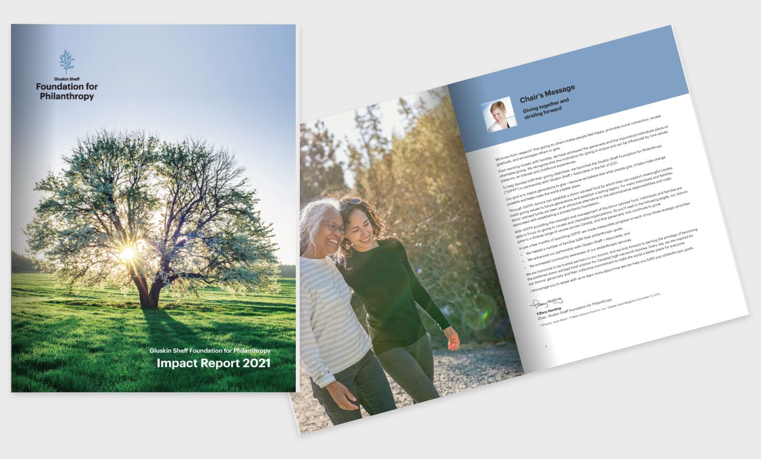
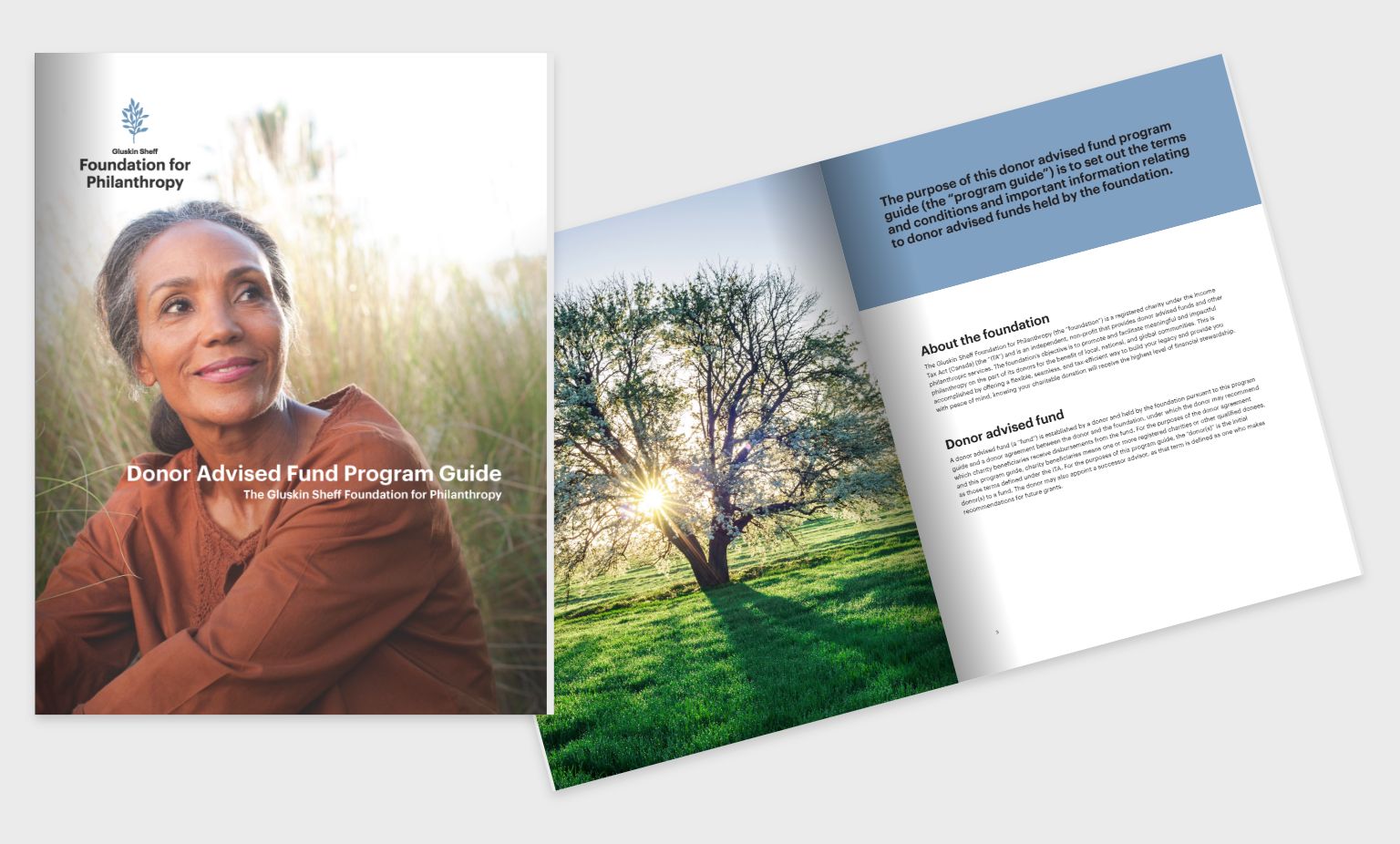
As part of the Philanthropy visual brand we worked on, we were asked to design a premium print piece to educate clients on this new product.
Design Process: After consultation with Gluskin Sheff and our work on the visual brand development, we focused on designing the cover and a key spread to establish the overall look and feel of the piece. After approval of the initial creative, we were able to lay out the remainder of the Impact Report with clear direction and minimal feedback. Once approved, a print-ready PDF and an email-ready PDF were created.
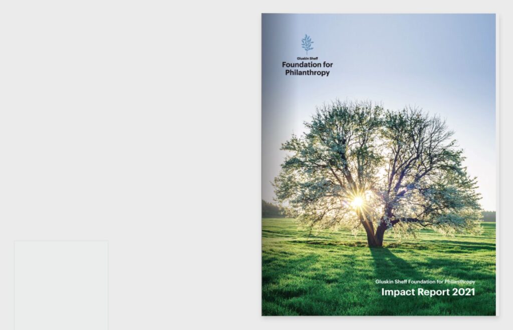
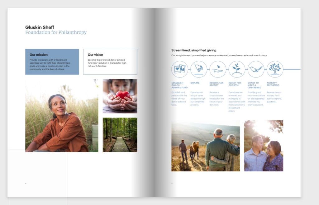
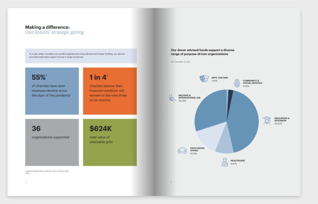
Solution: The Impact Report utilizes a powerful visual metaphor of nurtured growth by featuring a beautiful photo of a healthy, flourishing tree. Supporting imagery includes non-staged photographs of individuals and families in their target market, set in a natural setting to further reinforce the nature/nurture metaphor. Infographics and iconography are employed to convey information in a visually engaging manner. The final Impact Report is airy and inviting and effectively communicates its message to the reader.
Results: The Impact Report has been utilized in print and digital formats for several years, contributing to the success and growth of this philanthropic product.
Conclusion: By focusing on appropriate imagery and supporting graphics and employing a minimalist layout, we have created a piece that effectively communicates the message of philanthropy and charitable giving to its intended audience.
Our involvement
- Graphic Design
