The Project:
The FlipSide approached us prior to their official launch of their new business, seeking a brand that would accurately represent their business plan and vision.
Design Process: We began with an extensive discovery phase, delving into the founders’ perspective of The FlipSide, understanding their business objectives, target markets, and likes and dislikes. With a clear understanding of their brand direction, we designed multiple concepts for their review. Through a series of refinements, we arrived at a final logo suitable for print, digital, and social media. A concise brand guide was created to provide guidance for vendors and future branded projects.
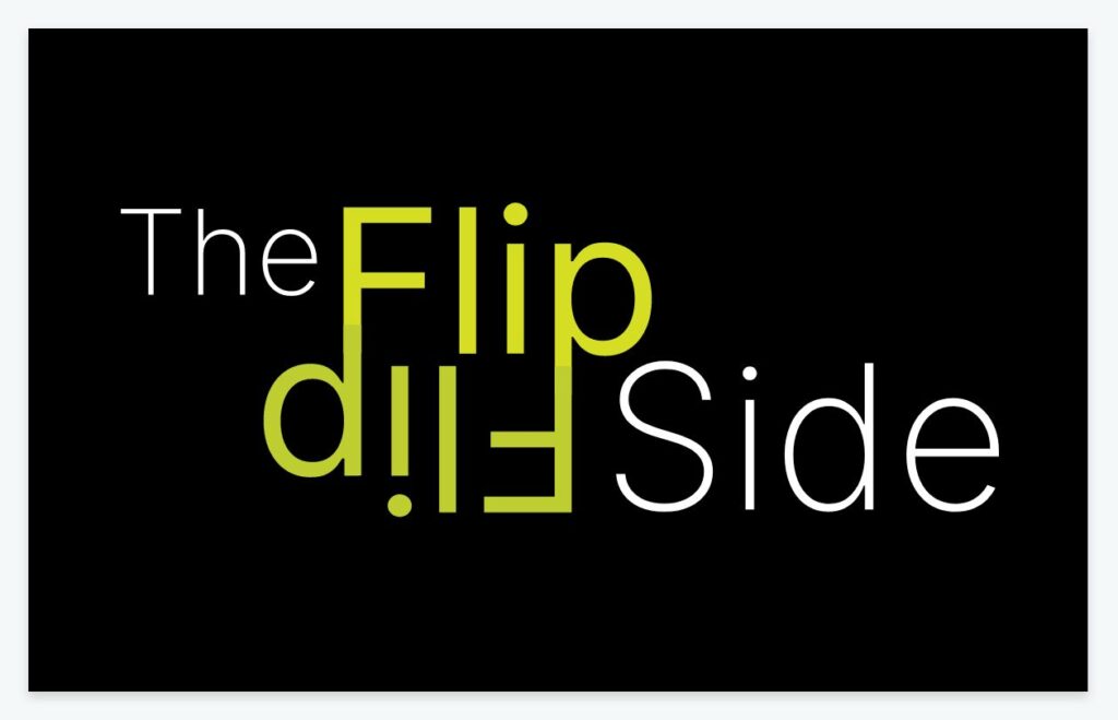
Solution: The FlipSide brand embodies the metaphor of flipping an idea on its head to see things from a different perspective. The logo visually represents this concept. The colour scheme combines a vibrant yellow/green with a subdued grey. The typography chosen is modern and timeless, ensuring the longevity of the logo. These attributes are intended to resonate with their corporate clients.
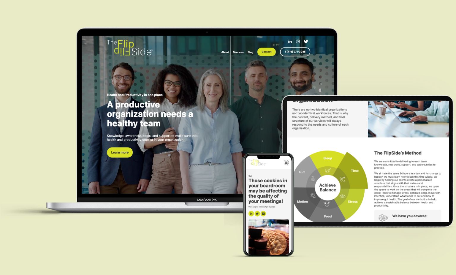
Results: The FlipSide team is highly satisfied with their logo and has received praise from clients and colleagues. The success of the logo has even prompted a website revamp.
Conclusion: Designing a visual brand is a complex undertaking. The crucial discovery phase allows us to deeply understand the essence of the company, align with the owners’ brand vision, and determine their desired brand direction. By focusing on discovery, we swiftly and effectively delivered a logo that hit the mark.
Our involvement
- Graphic Design


Maria Virginia Anzola and Rosana Fernandez
The FlipSide Health Coaching
We were referred to Chris by a marketing specialist and approached him to design the logo for our new venture. All we can say is that we are grateful and pleased with both the results and the entire design process. From the beginning, Chris made us feel completely at ease with his professional, polite, and approachable style, but more importantly Chris’ design integrity, passion and enthusiasm went well beyond his proposal to accomplish something endearingly timeless for us. From the start, he was able to articulate our values and philosophy in a clear and concise manner and provide a logo that would work to achieve our goals and appeal to our target market. We would also add that his insight and knowledge has not only helped with our logo and image, but also to shape our marketing strategy moving forward as well. Chris is a curious listener and welcomes feedback with openness and careful consideration. Working with Chris was an absolute pleasure, and we can only hope that this is the first of many future projects together. We would recommend Chris to anyone looking for a reliable, trustworthy, and talented logo designer.

