The project
Red Alert IT, a provider of IT services to business clients, enlisted our help to plan, write content for, design, and build a new website. The objective was to create a powerful marketing tool and a valuable resource for existing clients.
Design process: During the discovery phase, we closely collaborated with Red Alert IT to understand their target market and establish their position within the industry through their website. We conducted thorough research on local competitors and analyzed industry-leading websites. Following a user-centered approach, we crafted engaging copy and utilized wireframes and prototypes to validate design decisions. Once approved, we built the website, ensuring a clear understanding of the design and functionality requirements.
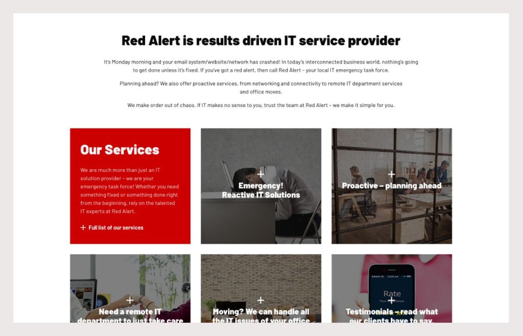
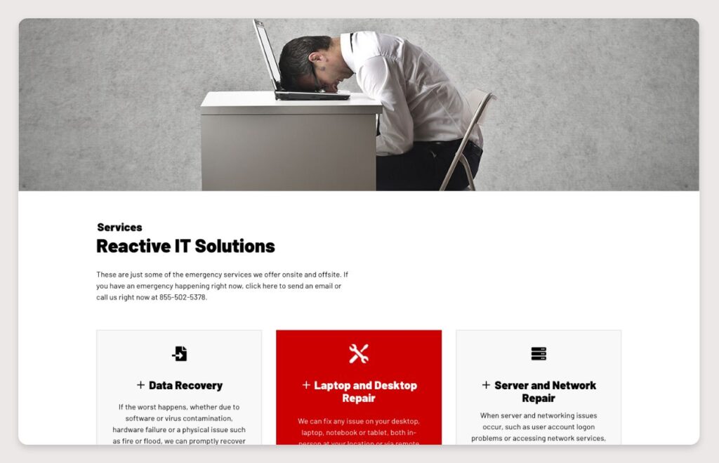
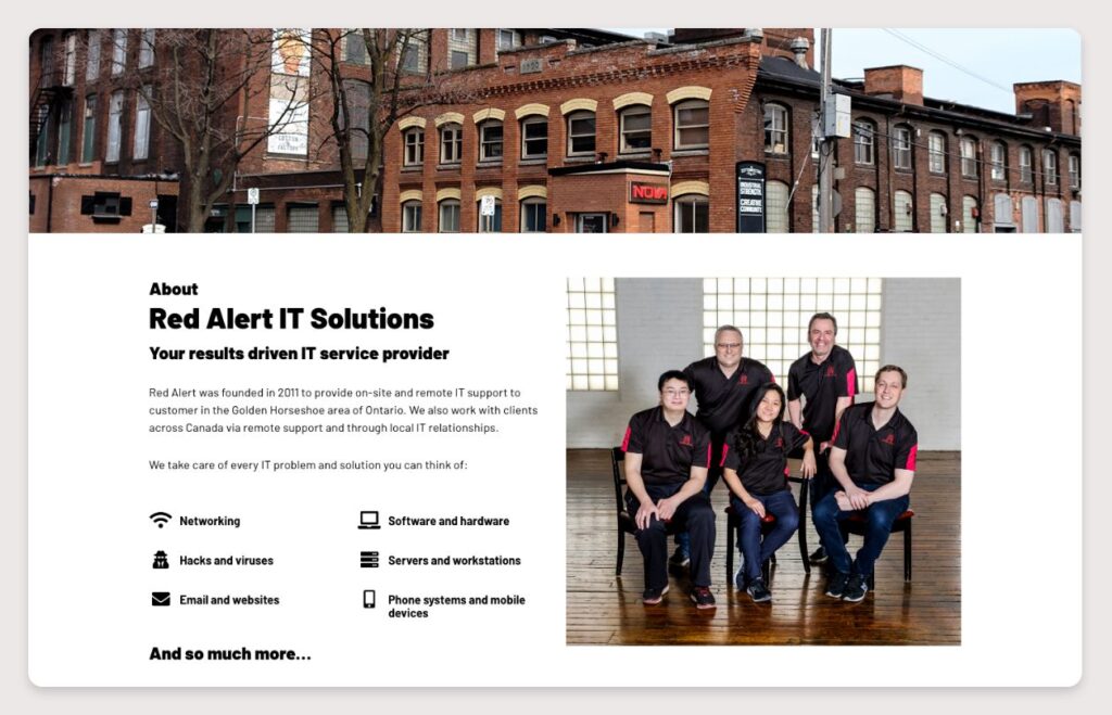
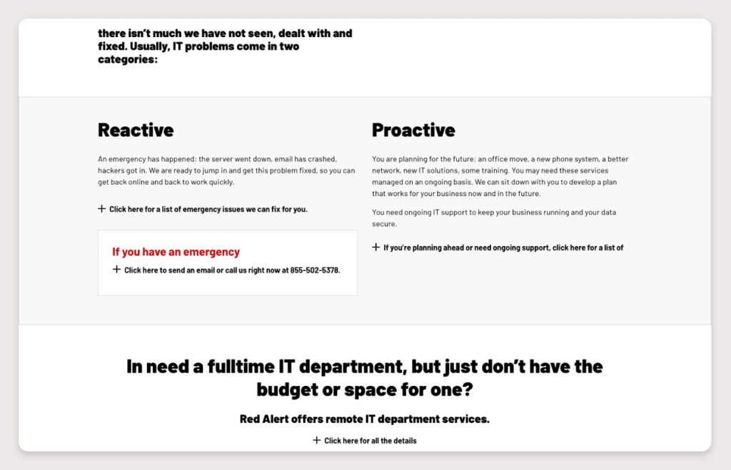
Solution: Based on the discovery phase, we recognized the need to integrate Red Alert IT’s ticketing system into the website to facilitate quick ticket submission by existing customers. We featured the ticketing system prominently on the homepage and in the main navigation. The website was organized into solutions, with sub-pages providing detailed information on individual services within those solutions. Iconography was heavily utilized to represent the various services offered visually.
Results: The new website has proven to be a valuable resource for existing clients while effectively directing potential customers to Red Alert IT’s services.
Conclusion: Given the scale of the website, our focus was on establishing a clear hierarchy of information, allowing users to navigate and explore topics of interest easily. We aimed to create a clean and intuitive navigation structure.
Our involvement
- User experience design (UX)
- User interface design (UI)
- Content writing
- Development in WordPress
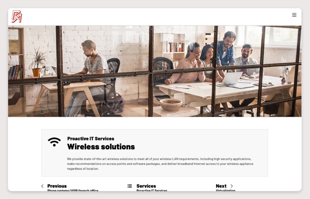
Desktop version of website

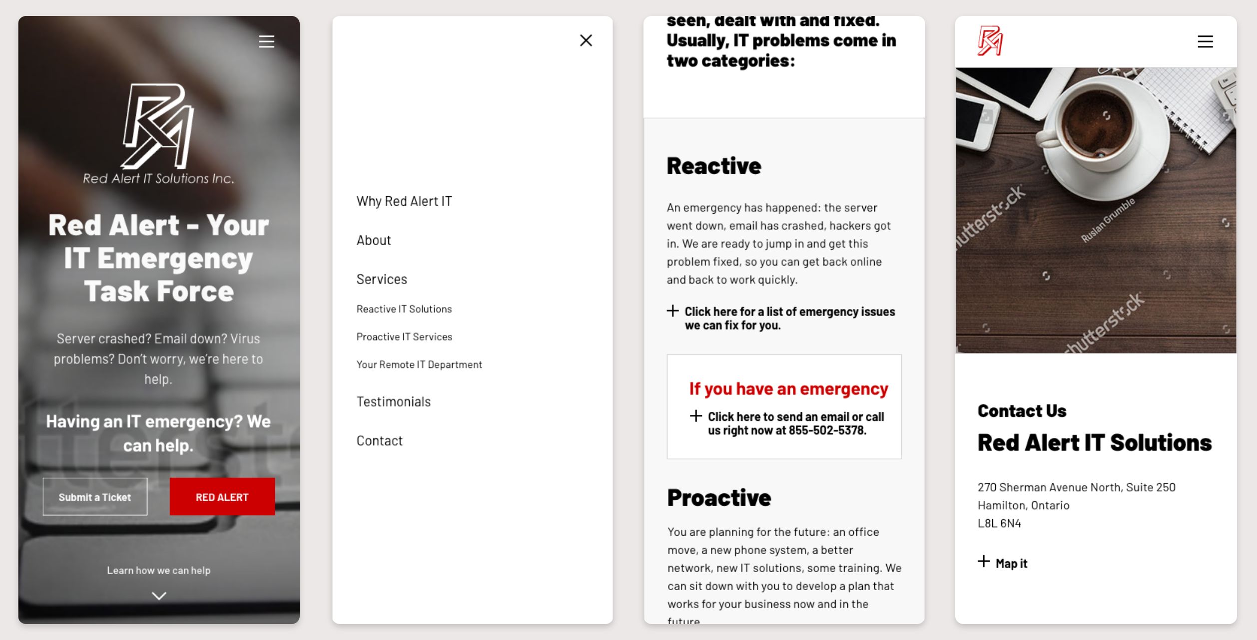
Mobile version of website
