The project
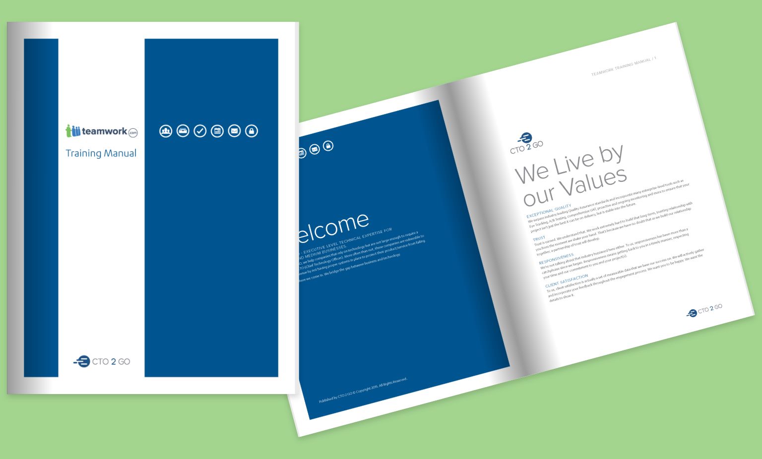
CTO 2 GO, a managed IT consulting company, enlisted our services to design their training manual. The goal was to create a comprehensive, user-friendly manual that effectively conveys the information to the end reader.
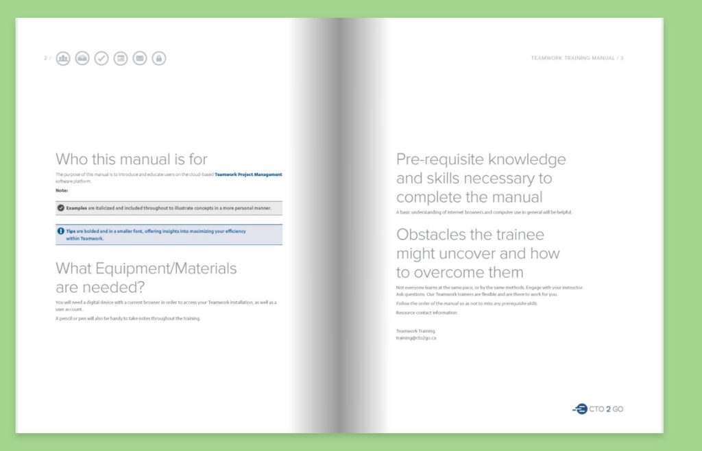
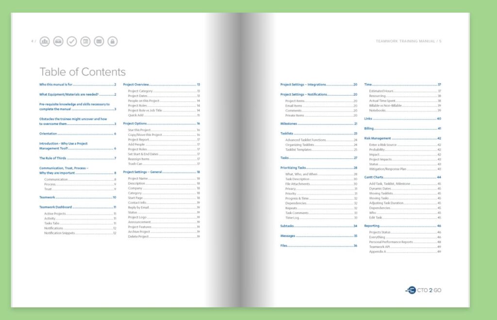
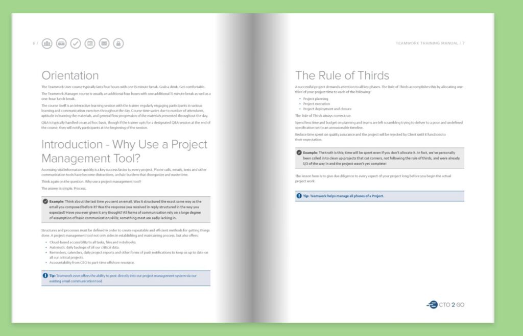
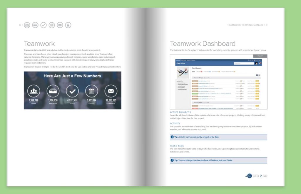
Design process: During the design process, our main focus was to understand the content included in the manual and how the end reader would engage with it. We carefully analyzed the information provided by CTO 2 GO to identify the key sections and topics that needed to be covered. We collaborated closely with the client and designed a few key pages to establish the overall look and feel of the manual. Once approved, we proceeded to lay out the entire manual.
Solution: The final design of the training manual adopted a simple, clean, and clear approach. We utilized ample white space throughout the manual, allowing the content to breathe and ensuring readability. To enhance the user experience and facilitate navigation, we incorporated iconography to highlight common types of content and guide the reader to specific sections.
Results: The training manual received positive feedback from CTO 2 GO and the end-users. The design, with its clean and clear layout, made the manual easy to read and follow. The strategic use of icons helped users quickly identify and locate relevant sections within the manual, enhancing their overall experience.
Conclusion: Understanding the needs and requirements of the end reader was crucial in developing a training manual that effectively conveyed the necessary information. By adopting a simple and intuitive design, we created a user-friendly manual that met the objectives of CTO 2 GO.
Our involvement
- Graphic Design
Desktop version of website
