The Project:
Following the successful design of The FlipSide’s logo, we were approached to redesign their website in alignment with their brand and improve their engagement with potential clients.
Design Process: During the discovery phase, we closely collaborated with The FlipSide to accurately identify their target clients and establish their positioning with those clients. Thorough research was conducted on competitors and industry-leading websites, both domestically and internationally. Our design process followed a user-centered approach, utilizing wireframes and prototypes to validate design decisions. Once approved, we proceeded to build the website, ensuring a clear understanding of both the design and functionality requirements.
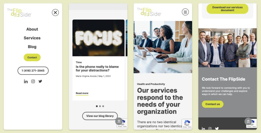
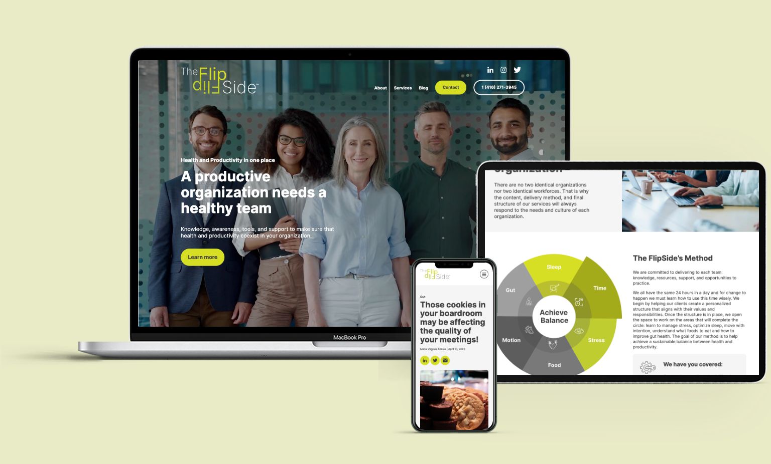
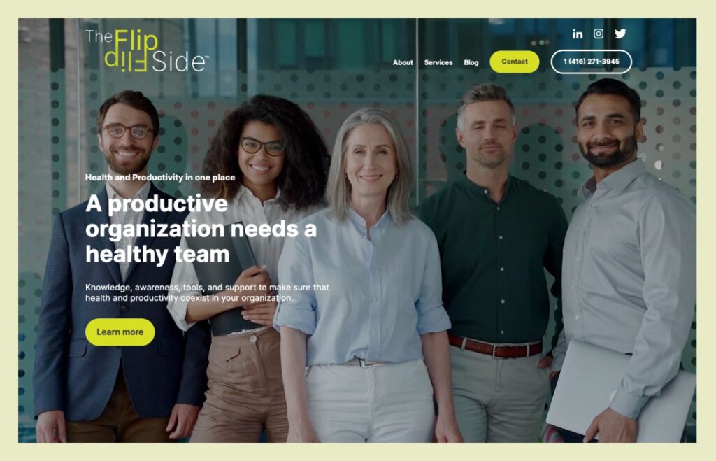
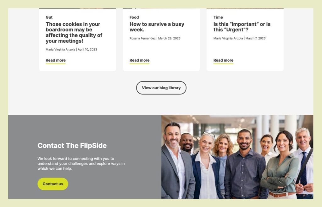
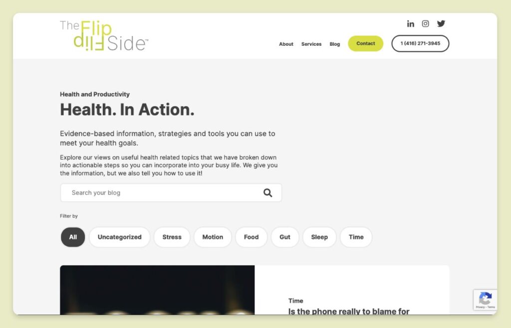
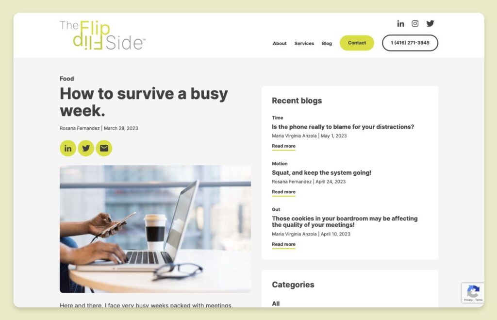
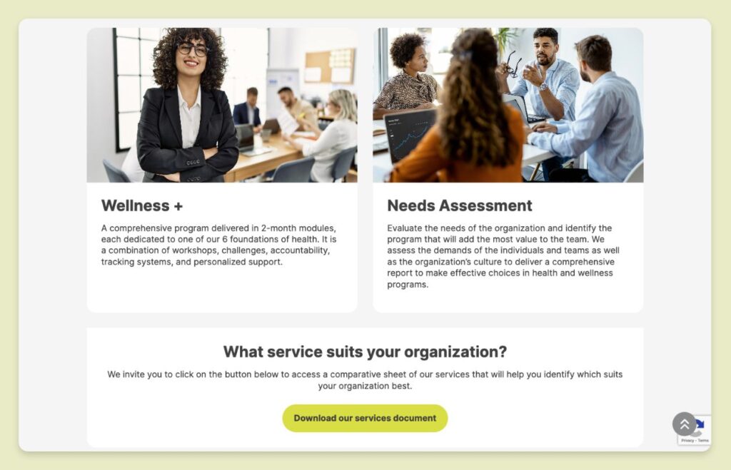
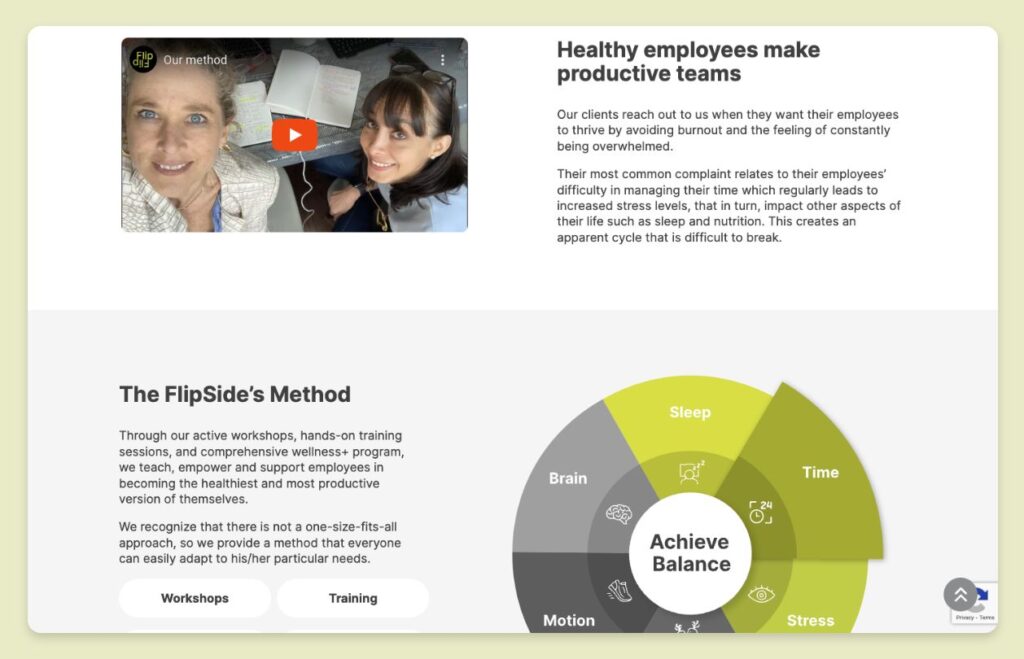
Solution: The FlipSide website incorporates a video on the landing page to capture users’ attention and engage them further quickly. The content was crafted to be concise and direct, allowing us to focus on impactful visuals supporting the overall message. The bright yellow colour is used strategically, drawing attention to important calls-to-action and key concepts on the website. The website was built using WordPress and Gutenberg, enabling The FlipSide to manage content updates and their blog easily.
Results: The FlipSide team is highly satisfied with their website and actively utilizes it to drive leads. The website serves as a central hub for The FlipSide brand.
Conclusion: By thoroughly understanding the business objectives of the website and aligning with The FlipSide’s desired direction, we were able to design and develop an impactful website that they are proud to showcase. It effectively communicates their message and helps drive potential clients to their business.
Our involvement
- User experience design (UX)
- User interface design (UI)
- Content writing
- Development in WordPress Gutenberg
Desktop version of website
Mobile version of website
